

GRAND DESIGNS: MAAP TDU POP-UP
Through a critical lens, we dissect the architectural, cultural and design qualities of the MAAP Pop-Up.
This article was originally published in the January 2020 issue of Architectural Digest, who in turn gifted us the rights for republication.
SECTIONS
I: THE CRITICS
II: THE CRITERIA
III: THE SPACE
A staple of modern Tour Down Under life, the growing phenomenon of the branded pop-up is an activated cornerstone of the TDU social experience, and a true chance for brands located in the tour village, or in this case within the wider Adelaide CBD to flex the aesthetic hemisphere of their brains in creating a space that cops plenty of online attention for this one week in January. Wanting to uncover and showcase the intimate details of these spaces, we recruited experts in the field of Design Culture and Architectural Beauty and sent them out into the field to visit the MAAP Pop-Up.
I: THE CRITICS
Job listings on LinkedIn, Seek and Dezeen Jobs proved wildly successful, but as is common these days, after making each candidate run the hiring process gauntlet, we opted to fill the required positions internally with two of our firms interns. Enter Oli and Adrian. Each of them are currently in unpaid roles despite their remarkable curriculum vitaes in their respective fields, but the opportunity to gain such vital experience during a busy and well covered week in Adelaide was too hard for our blood thirsty young’n’s to pass up. It also just so happened that they had immediate availability for the half hour required to conduct such work.

OLI
CREDENTIALSi) 5 years Architectural experience
ii) Photo of Kevin McCloud in his wallet
iii) Has read every single article on Dezeen
iv) Modern day Roberto Burle Marx

ADRIAN
CREDENTIALSi) 27 years of junior cultural experience
ii) Internal Monologue sounds like Jony Ive
iii) Aperçu modelled from his handwriting
iv) Appeared on The Loop’s Featured page
II: THE CRITERIA
During our visit, we aimed to critically examine the key social and cultural aspects of the MAAP Pop-Up, all while relating the space back to its aesthetic properties, particularly those within the realms of Graphic and Communicative Design, Fashion, Brand Integrity, Architecture and Interior Design.
III: THE SPACE
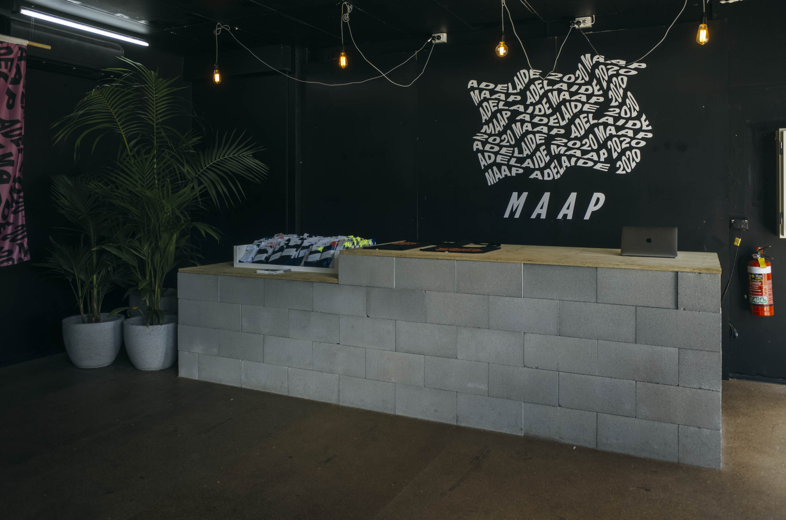
We start with the façade. Firstly, MAAP should be commended for utilising local co-working shared space aka The Mill, a place in which they have occupied the last 3 years. Adoring the front of the pop-up, perched just above the front door are 2 flag devices, harking back to an earlier campaign from the brand (MAAP In The Field: Utah c.2017) all while serving notice to passers by that this is MAAP territory, encouraging those who catch a glimpse of the space from he streetscape to come inside and become a MAAP Citizen.
Watching the flags flutter in the warm Saturday afternoon breeze is not dissimilar to laying witness to large scale photographic prints of the moon landing. Instead of stars and stripes, slanted letterforms reveal themselves with each unfurling. It would be interesting to see the flag and citizen relationship evolve come Sunday afternoon up on Willunga Hill.
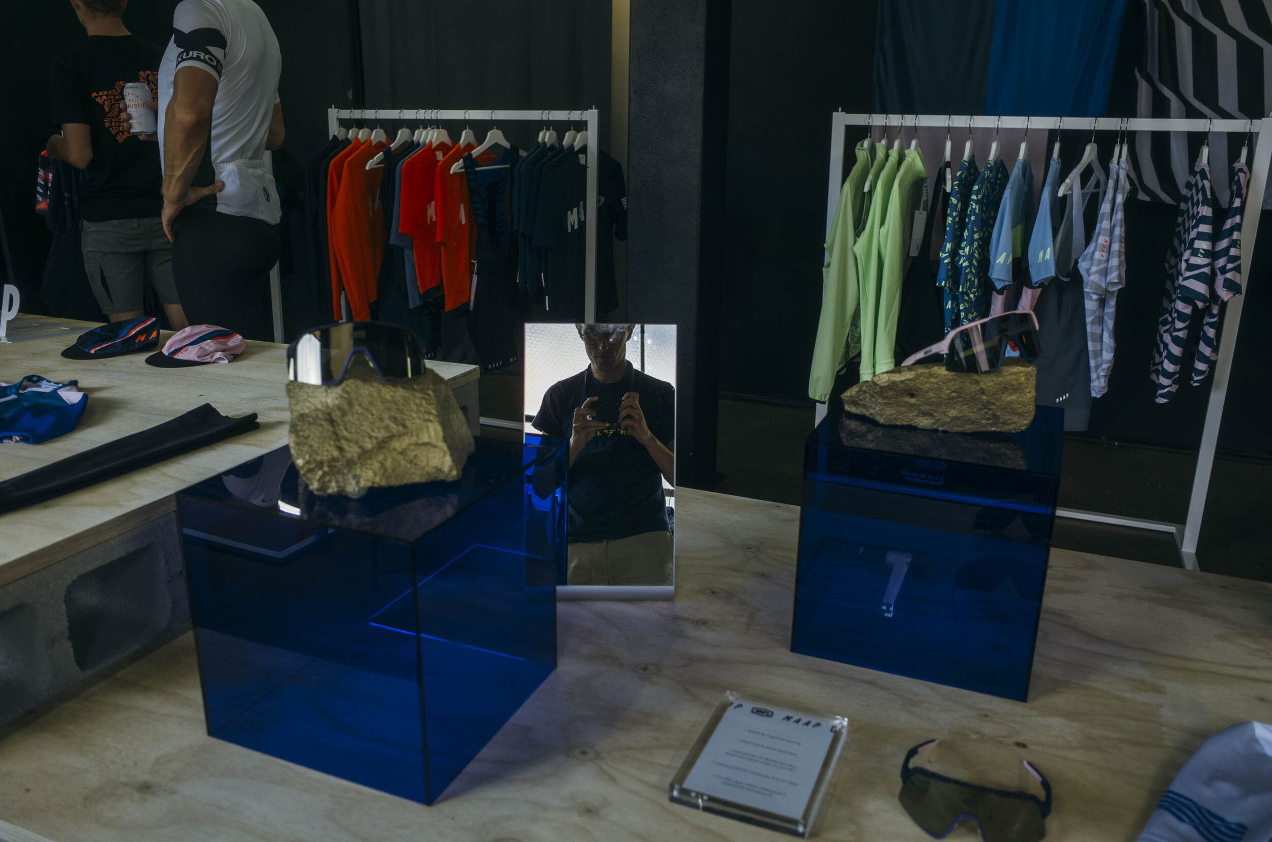
Four stools have been colour matched to the typical brand colours of MAAP – in this case an electric blue. Of course such a vibrant on screen colour is impossible to recreate as paint on an Ikea chair, but this muted down iteration is indeed worthy of praise. Inspecting the outside of the building, which itself has been painted a blue grey in contrast to the rest of The Mill’s weathered white render, we are soon invited in by Paddy, offering us a sign of peace; perhaps this branded planet isn’t so scary after all.


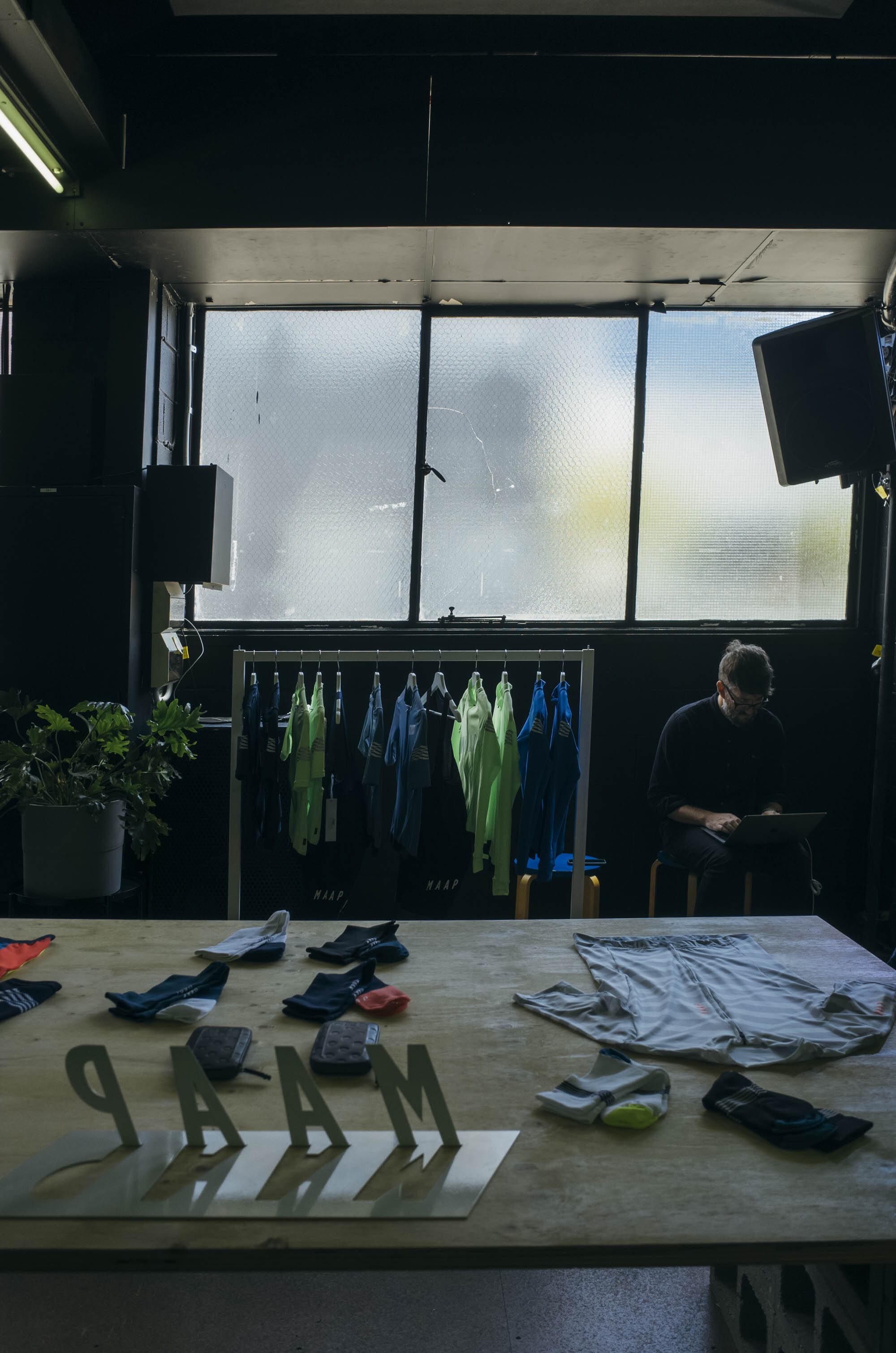
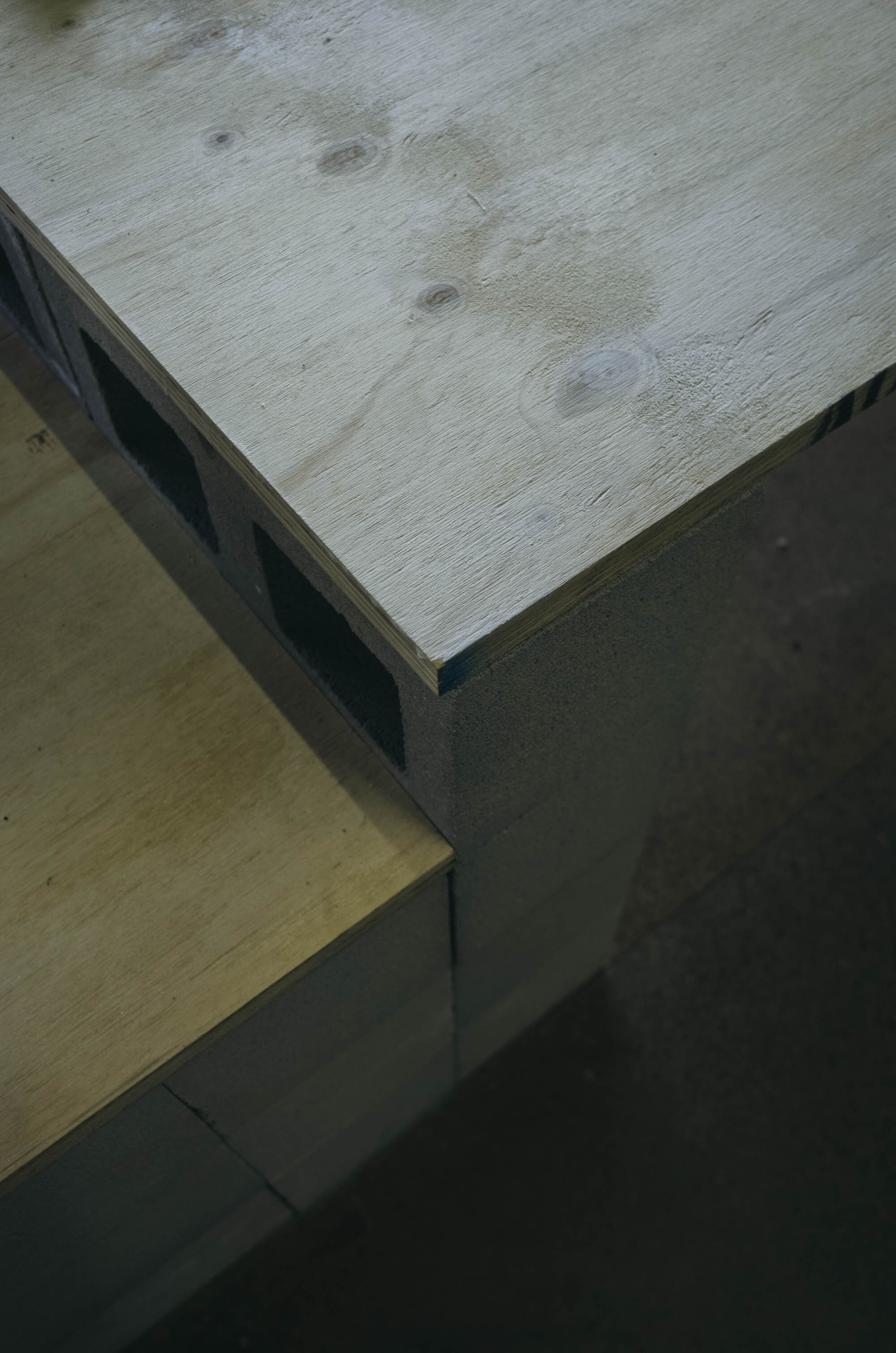
Moving inside the space itself is simple – in a good way – and unchallenging. While your eyes may need to readjust to the change in lighting conditions, not a second later you will be able to regather your bearings. The layout is quite simple, easy to navigate and showcases the product nicely. It potentially utilises either Jan Tschichold’s “Golden Canon of Page Construction”, Le Corbusier’s “Golden Ratio”, or the “Fibonacci Sequence” translated via an arrangement of cinderblocks, we’re not entirely sure, but it is no doubt a nice touch implemented by the MAAP design team.
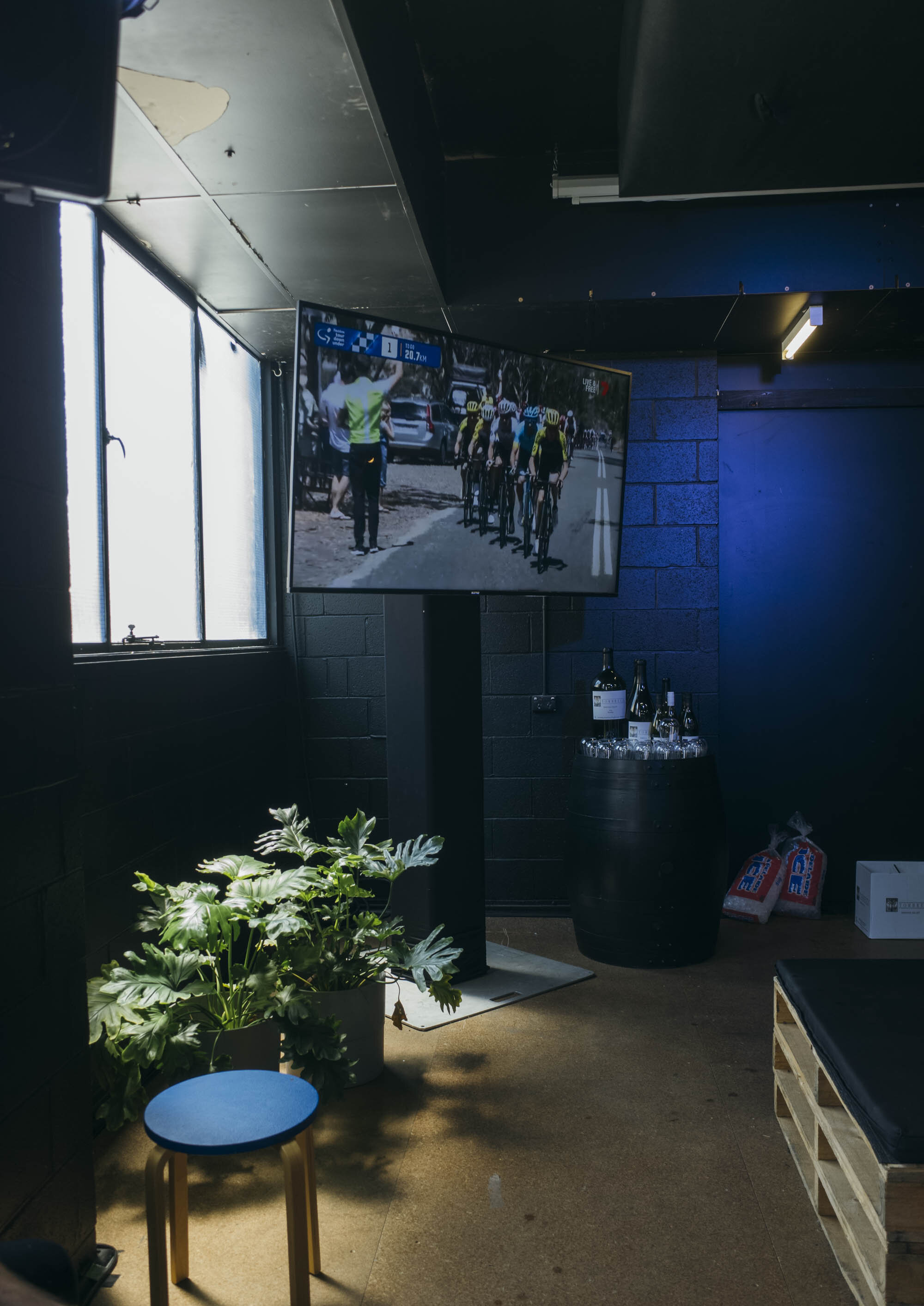
Comparing it to what you would call their major rival – Rapha; the MAAP pop-up does give you an inviting box to escape the suns rays, and does provide beers. But is it the kind of place you would want to drop by and hang for a bit? During a rarely mild Tour Down Under week we’re not so sure happy hour drinks are enough. From past years Rapha have been much better at creating a space you can stay in, plus their focus on providing more than 1 non-alcoholic option is always welcomed from those not too fond of ZZZ HOPS BASED SPORTS DRINKS ZZZ after a few hours of riding bikes in the sun.
What is evident however is how open MAAP are to pushing the envelope in terms of interior design, in what we could say is a perfect example of not playing it safe. While Rapha has hosted a more inviting space, 2020 marked an edition of their pop-up where it expanded even further within a new space.
While this approach came with plenty of pro’s, one major con was the lack of intimacy, unless you were curled up on one of the bean bags. The MAAP pop-up however, with its lower ceilings, noticeably smaller square footage and darkly painted walls gives you something of a warm hug. You might not think it’s what you crave after riding on a lovely summers day, but you’d be wrong.
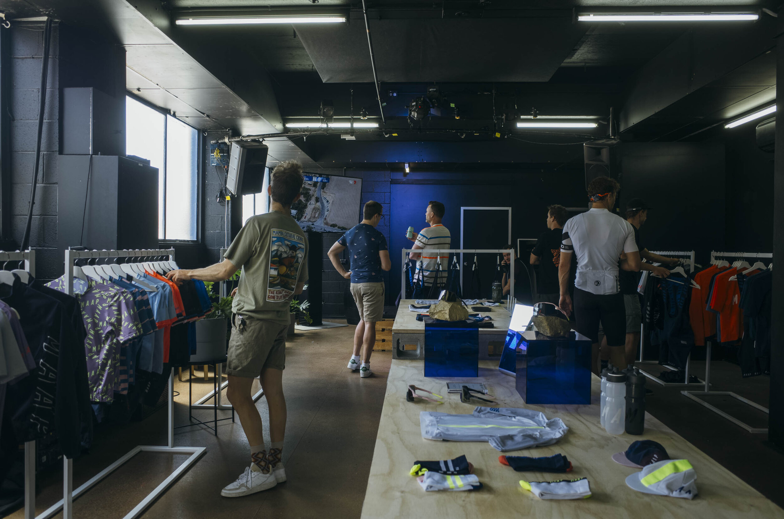
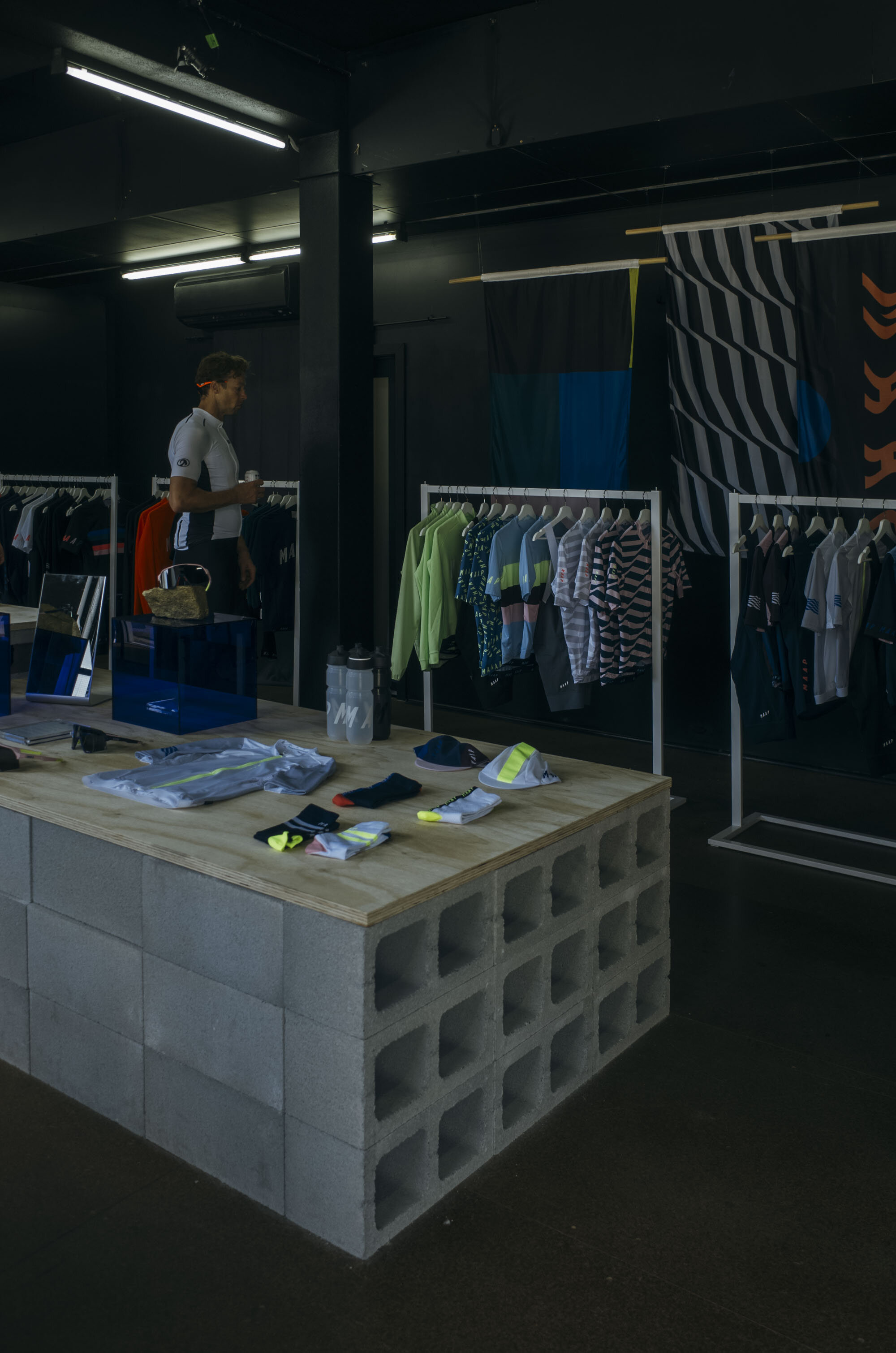


Where they continue to push the envelope is with their clothing range. There is an interesting coming together of similar themes when viewing the relationship of MAAP clothing and the MAAP space. Some could argue that the design styles and the colour palettes chosen date quicker than Rapha, who seem to have held their place well over the last decade, but there is something truly commendable about the way MAAP are approaching kit design style. We should send them a hamper of Soup Boys merch as thanks (and for inspo).

Finally, the textures. They possess similar traits to the layout of the space, simple, and very suitable in the construction of a pop-up store. Interestingly enough, they considered the conditions and the landscape of the days stage to Victor Harbor, mostly flat, a little barren and dried by the summer in the choosing of their materials. Think plywood and cinderblocks, both reusable and showing the conscious that many brands are heading in when looking to construct a pop-up store at an international level bicycle race in Australia.
Amongst the austere materials we found a suite of truly hyphy plants, no doubt purchase from Bunnings as lil sprouts and nurtured to good, bountiful health. Rocks spray painted gold – used to showcase the new range of MAAP x 100% sunglasses – dazzled in a quirky way, embellishing the otherwise meticulously flatlay-ed central display table. On the walls featured Dulux paint in dark tones, or maybe it was Taubmans, British paints, or hell even Porters (we didn’t actually ask) but the darker colour softened the space, and with the diffused light through large windows to the west, provided plenty of reflective light that would have no doubt been ace for selfies.


There’s no doubt that with such ingenuity, and smart consideration of space that the MAAP team have come safely under budget for this build. Considering they were open for business before the Tour Down Under officially kicked off, you are correct in assuming they completed works well on time, before the wet season approached and everything turned south.
Despite all this, the existence of the space still belies the question of: is it too much of a shop? It may be a bit too much for some, especially considering the offerings of Rapha and the Tour Village which are a bit more tuned towards shared social spaces, there’s no doubt this has been a successful build – after all they could afford to be open on a Saturday unlike the Noufaux Francais Black Sheep Chateau down the road.